Competitor/Market Place Research Conclusion
The magazines I analysed were, Country Music People, Maverick and Cross Country People. Country Music People and Maverick were brought from a shop, and can be purchased off the internet, and Cross Country was brought from the internet and can’t be brought from a shop. These country music magazines are all aimed at people who like country music probably about aged 14 and above because some of the articles and concepts of the magazines are quite mature and I don’t think people below 14 are going to be going to gigs, musicians, someone who is specifically interested in a article in the magazine, people who want to find out about tour dates for example. All the magazine have about 90-100 pages. The front covers of the magazines were all similar in the way that the page was simple, with only one picture and not much text. Maverick and Country Music people were much brighter therefore appealing to look at, as Cross Country has a dark background. The mode of address of these two was also friendly, and lighthearted, but also serious in both and had a gossipy style of writing. The mode of address for Cross Country seemed more serious with an informative style. The masthead on Country Music people and Maverick is very bold, colourful and your attention is brought straight too it when you look at the page, whereas the masthead of Cross Country is small and hidden slightly by the picture. The puff lines are all similar, all relevant to the style of music, they are all in small writing, and Cross Country is in the smallest which makes the puff line hard to see. The colours used are all similar in all the magazines, all the magazine use white and red, and Country Music People and Cross Country use blue, Cross Country uses black too. The bar codes are all at the bottom of the page on each magazine.On the contents pages all the magazines have a clear heading ‘Contents.’ The page numbers and what’s on each pages, are all simply listed in each magazine. The fonts are all similar or the same on the contents pages to the fonts used on the front cover. In each magazine all the contents pages are simple and easy to read. In Maverick and Cross Country completely new fonts are used for the title ‘Contents’. The amount of pictures on the contents pages in each magazine is very different. In Maverick there are ten different small images on the page, in Country Music people there is one behind the text large image, and in Cross Country there are no images on the contents page. The colours used are completely different in each magazine. The double page spreads in each magazine are similar by that there is use of text, photos and quotes, however the amount of these does vary. The amount of pictures on the double page spreads does vary in each magazine, as Maverick only has one picture, but Cross Country has seven. The fonts are all small and easy to read and the pictures are all relevant to the article. The fonts are all simple colours, black or white.
Overall the two shop brought magazine are most similar, as they were closest in price, size, mode of address, colours used etc. When designing my magazine I will focus on Maverick and Country Music People, as I feel like the style, mode of address, colours, etc are more relevant to the style of magazine that I want to do, and according to my question what my target audience prefer.
Tuesday, 17 November 2009

Competitor/Market Place Research-Cross Country
Cross Country

An issue of Cross Country is released every month; I have the November 2009 issue. It has 100 pages and it is 21cm high and 15cm wide. I brought it off the internet as it’s not available in many shops. It contains a lot about tours, tour dates, gigs, awards. There are also some articles on artists. The target audience for the magazine would be people who are interested in country music, people wanting to find out tour dates etc, musicians and people who are interested in a certain section of the magazine.

The colours used on the front page are mainly blue and white with a little red, this could be to represent that it’s a British music magazine as they are the colours on the flag. A very dark background is used, which makes the writing stand out, but it does make the magazine seem less friendly. White and black are the main colours used; the text in black is in bolder writing than the white text. There are two different styles of fonts used on the whole front cover. The masthead, the magazine name ‘Cross Country’, part of it is behind the image which draws the reader’s attention to the image before the magazine name. The name is cleverly written as instead of an O they have used an X, this is a play on words with the word ‘cross’. The page is kept quite simple, with only one candid image, which is a mid-shot. There are a few various bits of texts on the page, making the reader look at the main feature article picture and head line to. The headline is at the bottom the page, but made to look important as it’s in bold and is highlighted between to lines making it look like a banner. The mode of address seems quite friendly, but also serious and informative. The puff line ‘British Country Music At Its Best’ this puff line is relevant to the magazine, but its not easily seen on the page and your attention isn’t straight away brought to the line, and its in quite small writing along the left hand side of the page.
The contents page is five pages into the magazine after lots of advertisements. The bottom half of the page is taken up by two articles advertising gigs. The top half of the page is a blue text box, which has fading colours from blue to white all smudged into one. There is then two columns simply listing each page number, and what’s on that page. The font is small and all the same simply writing, except for a few words ‘the ultimate who is on where in the UK’ which is in the same font but lighter not as bold writing. The title ‘Contents’ is in a completely new font from the front page. It is in blue large writing, the same colour as the text box, the font is simple and easy to read. The background of the page is just plain white. At the bottom of the page in the corner in small font, the same as some on the contents page, it says the magazine name next to the page number.
Throughout the magazine there aren’t actually as many double page spreads as you would except in a magazine. The one I have chosen to analyse is about the Country music awards which relates to the main article on the front cover. The page looks quite busy as there is quite a lot of pictures and writing. The first page is half text half pictures. The font is different to the front cover, and is the same as the contents page, but it’s not as bold. The names of the singers are in bold. In the space next to the text there is a picture of a country music award. Under this across the whole page there is a 2mm gold line separating the text from the pictures. There are three pictures at the bottom of the page; one of them is a two shot, mid shot candid image, the same picture as the front cover, just zoomed in more. Another picture is a candid mid shot image of a man singing, and the last picture is a candid two shot mid shot of someone getting there award. There is some italic writing above the pictures saying who’s in the pictures. At the bottom at the page there is another gold line. The second page has two gold lines, one at the top and one at the bottom. The whole page is pictures, there are five of them, all what look like people playing or receiving there awards, all candid. There is also italic writing on this page, telling the reader who is in the pictures.
The contents page is five pages into the magazine after lots of advertisements. The bottom half of the page is taken up by two articles advertising gigs. The top half of the page is a blue text box, which has fading colours from blue to white all smudged into one. There is then two columns simply listing each page number, and what’s on that page. The font is small and all the same simply writing, except for a few words ‘the ultimate who is on where in the UK’ which is in the same font but lighter not as bold writing. The title ‘Contents’ is in a completely new font from the front page. It is in blue large writing, the same colour as the text box, the font is simple and easy to read. The background of the page is just plain white. At the bottom of the page in the corner in small font, the same as some on the contents page, it says the magazine name next to the page number.
Throughout the magazine there aren’t actually as many double page spreads as you would except in a magazine. The one I have chosen to analyse is about the Country music awards which relates to the main article on the front cover. The page looks quite busy as there is quite a lot of pictures and writing. The first page is half text half pictures. The font is different to the front cover, and is the same as the contents page, but it’s not as bold. The names of the singers are in bold. In the space next to the text there is a picture of a country music award. Under this across the whole page there is a 2mm gold line separating the text from the pictures. There are three pictures at the bottom of the page; one of them is a two shot, mid shot candid image, the same picture as the front cover, just zoomed in more. Another picture is a candid mid shot image of a man singing, and the last picture is a candid two shot mid shot of someone getting there award. There is some italic writing above the pictures saying who’s in the pictures. At the bottom at the page there is another gold line. The second page has two gold lines, one at the top and one at the bottom. The whole page is pictures, there are five of them, all what look like people playing or receiving there awards, all candid. There is also italic writing on this page, telling the reader who is in the pictures.
Monday, 16 November 2009
Competitor/Market Place Research-Country Music People
Country Music People
I brought this magazine from WH Smiths, for £3.10. The magazine is released monthly I have the October 2009 issue. It has 64 pages, and is 29.5cm long by 21cm wide. The magazine contains articles about singers, some history about country music, tour dates, letters, country music charts and CD reviews. It would be aimed at people who are interested in country music the age group would be about 14+, people who are interested in certain articles in the magazine, musicians would also be i nterested.
 nterested.
The colours used on the front cover of the magazine are all kept mainly the same, blue, red and white. The feature article photo model is also wearing blue and has blue eye makeup. These colours help keep the magazine interesting and bright, and don’t make the page too busy and full of colours. The background is white, which makes the rest of the page stand out. The photo is a posed mid-shot her face is happy, but serious which suggests she wants to be liked but wants her music to be taken seriously. You can see the shadow of the singer in the picture; this is a good effect as it adds depth to the picture. There is a friendly mode of address, it is also informal language. The masthead (name of the magazine) is bold and relevant to the style of magazine. The puff line ‘from Austin to Nashville and beyond’ this line is colloquial and speech like, and also relevant to country music.
The contents page uses the same colours as the front cover, keeping the look and style the same. The contents page is split into sections, e.g., Features, Reviews, Regulars and Charts. This would make it easier for the reader to find what they want. There is a long-shot posed photo of the featuring artist, the white background and shadow is kept the same. There is only one photo on the page, and the text is in front of the picture, bringing the readers attention to them. The font is very similar to the front cover; it does vary a little more though. The size of the text varies, emphasising what is the main bits of the information and what isn’t as important. The colours used on this page are the same as the front cover, red is mainly used on this page, and there are a few words in white and black, also keeping the magazine style the same.
Throughout the magazine there is lots of double page spreads. The double page spread I have chose too look at is about a country singer. The article actually spreads onto 6pages. Looking at the first page, it has dark back ground, with white simple writing. The writing is all the same font, and changes size 5 times. There is one picture on this page, at the top it is a posed mid-shot image, in black and white. At the top there is a logo, representing the artist ‘COLTFORD.’ The heading ‘real country living’ is bold and simple, giving the reader an idea what the article will involve. The strap line is a complex sentence summing up about the artist and what the article is about ‘Duncan Warwick meets the larger than life artist who has achieved the impossible, but successfully fusing Country and Hip-hop, and people have started to sit up and take notice.’ The sentence is quite informal and has a friendly tone. The first few lines of the first paragraph, ‘COLT FORD WOULD’ this is in bold, which emphasises his opinion. The rest of the article has a lot of quotes in ‘a new, creative sound for the all-American everyman.’ These quotes would enable the reader to feel like they can connect with the artist more. At the bottom on the page there is a ‘COLT FORD’ which is in bold, which again emphasises what the article is about.
On the next page there is a A4 sized mid-shot posed image of ‘Colt Ford.’ The background is outside, of something that looks like it’s in the West Country. The sky is quite grey and stormy looking, which contrasts with artists bright yellow top, this draws the readers attention to the man. The sunglasses he is wearing creates quite an unfriendly look, which is emphasised by him not smiling. This could just suggest that he wants to be taken seriously. There is only one bit of writing on this page, ‘I’m a country artist. I just happen to rap, that’s the way I deliver it.’ This quote being the only text, and as it’s in black puts across the point to the reader that Colt Ford wants his opinion recognized.
The contents page uses the same colours as the front cover, keeping the look and style the same. The contents page is split into sections, e.g., Features, Reviews, Regulars and Charts. This would make it easier for the reader to find what they want. There is a long-shot posed photo of the featuring artist, the white background and shadow is kept the same. There is only one photo on the page, and the text is in front of the picture, bringing the readers attention to them. The font is very similar to the front cover; it does vary a little more though. The size of the text varies, emphasising what is the main bits of the information and what isn’t as important. The colours used on this page are the same as the front cover, red is mainly used on this page, and there are a few words in white and black, also keeping the magazine style the same.
Throughout the magazine there is lots of double page spreads. The double page spread I have chose too look at is about a country singer. The article actually spreads onto 6pages. Looking at the first page, it has dark back ground, with white simple writing. The writing is all the same font, and changes size 5 times. There is one picture on this page, at the top it is a posed mid-shot image, in black and white. At the top there is a logo, representing the artist ‘COLTFORD.’ The heading ‘real country living’ is bold and simple, giving the reader an idea what the article will involve. The strap line is a complex sentence summing up about the artist and what the article is about ‘Duncan Warwick meets the larger than life artist who has achieved the impossible, but successfully fusing Country and Hip-hop, and people have started to sit up and take notice.’ The sentence is quite informal and has a friendly tone. The first few lines of the first paragraph, ‘COLT FORD WOULD’ this is in bold, which emphasises his opinion. The rest of the article has a lot of quotes in ‘a new, creative sound for the all-American everyman.’ These quotes would enable the reader to feel like they can connect with the artist more. At the bottom on the page there is a ‘COLT FORD’ which is in bold, which again emphasises what the article is about.
On the next page there is a A4 sized mid-shot posed image of ‘Colt Ford.’ The background is outside, of something that looks like it’s in the West Country. The sky is quite grey and stormy looking, which contrasts with artists bright yellow top, this draws the readers attention to the man. The sunglasses he is wearing creates quite an unfriendly look, which is emphasised by him not smiling. This could just suggest that he wants to be taken seriously. There is only one bit of writing on this page, ‘I’m a country artist. I just happen to rap, that’s the way I deliver it.’ This quote being the only text, and as it’s in black puts across the point to the reader that Colt Ford wants his opinion recognized.
Competitor/Market Place Reseach-Maverick Magazine
Analysis of existing magazines
I have brought three existing magazines which I will analysis which will improve my knowledge about the conventions and styles of country/western magazines.
Maverick
I have brought three existing magazines which I will analysis which will improve my knowledge about the conventions and styles of country/western magazines.
Maverick
An issue of this country music magazine is released each month; I have the November 2009 issue. It has 97 pages, and is 29.5cm high 21cm wide. I brought it from WH Smiths for £3.50. It contains information about singers, and some tour dates, CD reviews, country music charts, letters from readers, articles on artists and much more. The target audience for this magazine who be 14+, people who are into country music, musicians and people who are interested in a certain article in the magazine
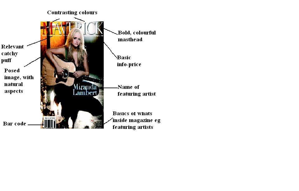

The magazine uses quite contrasting colours on the front page; half of the page looks black, and then the other half looks orange, these two colours amplify each other. The candles and the orange have a link, as the orange is directly above the candle it suggests that orange is the flame burning. White, and the same font is used, to keep the page simple, and red writing is used twice on the ‘M’ on the ‘plus.’ There is a bold, attractive masthead. The page is kept quite simple, with only one picture and not too much writing, this would attract the reader more and it’s easier to understand what the magazine is about quickly. All the writing also seems to either be at the top or bottom on the page, keeping the main part about the feature article. The feature article photo is a posed long-shot, as you can see the whole of her body. The singer has her head slightly turned to the right, which is a convention of a magazine to encourage the reader to open the magazine. The mode of address is friendly, as her face is soft, and the image looks calming. Although her face is a soft pose, it is also serious the connotation of this is that she wants her and her music to be taken seriously but also enjoyed. The puff line ‘the voice of country, folk, bluegrass and roots music.’ The word ‘voice’ could be ambiguous, relating to the singers, and actual music or be about the text of the magazine. This puff line is in quite small writing, so the reader isn’t drawn straight towards it. It relates to the magazine, and helps express what style of music the magazine is about. Like ‘Country music people’ there is also a shadow in this picture of the singer.
The contents page is in black and white, which could relate to western times and western music. The main fonts are the same as the front cover, but there is more variation in font styles on this page. The masthead ‘contents’ is bold, and the letters are spaced apart. The layout of the page is very simple, but effective. There are five square pictures down each side of the page, all one or two shot close ups. Not many of the faces in the pictures are actually looking directly at the picture, making them seem more natural and friendly. Some of the pictures have natural background. The writing is all in the middle of the ten pictures, the font is quite small, bold and italic is used. The page numbers and the rest of the writing are split up using a vertical line. At the bottom of the page very bold writing is used, ‘MAVERICK’ and above it small writing is used ‘ISSUE NUMBER EIGHTY EIGHT NOVEMBER 2009’ repeating some details about the magazine that was on the front cover.
Throughout the magazine there are lots of double page spreads. The one I have chosen to analyse is a double page spread about female country singer it’s about her life, her achievements and the history of her career. The first page is half picture and half writing. The top part is a mid-shot, of the singer. She has a serious but friendly face, the background is a gradually fading one, on the left it starts white then it get darker until on the right it’s nearly black. There is italic writing on the picture, telling the reader her name, and her main achievement ‘to say I have 33 albums in 33 year is amazing…’ The article is written in columns, which gives it a more formal feel. The font is either similar to the main font used on the contents page, or some of the important quotes are in italics. Chatty, colloquial friendly but informative language is used in the article. The first letter of the article ‘R’ is in bold, this is a convention used often in magazines.
The second page of the article is mainly text, and has one small picture of the singer which is a mid-shot but not as close as the picture on the first page. The picture looks like very similar to the picture on the first page, she is wearing the same colour, her hair is the same and she is wearing the same clothes it’s just the pose that is different. The picture is at the top left hand corner of the page, the picture being there separates the text, not making it look like there is so much to read. The font is exactly the same as the first page. The main quote is in italics and in a purple text box right in the middle of the page. This livens up the page, adding colour. The article ends with the name of the author is at the bottom on the article in bold.
The contents page is in black and white, which could relate to western times and western music. The main fonts are the same as the front cover, but there is more variation in font styles on this page. The masthead ‘contents’ is bold, and the letters are spaced apart. The layout of the page is very simple, but effective. There are five square pictures down each side of the page, all one or two shot close ups. Not many of the faces in the pictures are actually looking directly at the picture, making them seem more natural and friendly. Some of the pictures have natural background. The writing is all in the middle of the ten pictures, the font is quite small, bold and italic is used. The page numbers and the rest of the writing are split up using a vertical line. At the bottom of the page very bold writing is used, ‘MAVERICK’ and above it small writing is used ‘ISSUE NUMBER EIGHTY EIGHT NOVEMBER 2009’ repeating some details about the magazine that was on the front cover.
Throughout the magazine there are lots of double page spreads. The one I have chosen to analyse is a double page spread about female country singer it’s about her life, her achievements and the history of her career. The first page is half picture and half writing. The top part is a mid-shot, of the singer. She has a serious but friendly face, the background is a gradually fading one, on the left it starts white then it get darker until on the right it’s nearly black. There is italic writing on the picture, telling the reader her name, and her main achievement ‘to say I have 33 albums in 33 year is amazing…’ The article is written in columns, which gives it a more formal feel. The font is either similar to the main font used on the contents page, or some of the important quotes are in italics. Chatty, colloquial friendly but informative language is used in the article. The first letter of the article ‘R’ is in bold, this is a convention used often in magazines.
The second page of the article is mainly text, and has one small picture of the singer which is a mid-shot but not as close as the picture on the first page. The picture looks like very similar to the picture on the first page, she is wearing the same colour, her hair is the same and she is wearing the same clothes it’s just the pose that is different. The picture is at the top left hand corner of the page, the picture being there separates the text, not making it look like there is so much to read. The font is exactly the same as the first page. The main quote is in italics and in a purple text box right in the middle of the page. This livens up the page, adding colour. The article ends with the name of the author is at the bottom on the article in bold.
Wednesday, 11 November 2009
Survey Conclusion And Results
Results


Percentages
1. 57% Monthly
43% Weekly
2. 40% option 1
60% option 2
60% option 2
3. 60% option one
40% option two
40% option two
4. 46% option one
53% option two
5. 84% yes
15% no
15% no
6. 76% option one
23% option two
7. 69% yes
31% no
8. 7% male
11% female
82% both
9. 46% candid
53% posed
53% posed
10. 76% gossipy
24% informative
24% informative
11. 92% simple
8% busy
8% busy
12. 73% no
26% yes
26% yes
13. 92% all
8% local newsagents
8% local newsagents
14. 88% yes
12% no
12% no
Conclusion
From my survey I have learnt that my target audience would prefer a monthly release of my magazine, suggesting that they want a longer, more up to date detailed review and the monthly news and gossip. We know they want more of a gossip based magazine rather than informative as 20 people wanted gossipy and only 6 wanted an informative styled magazine, with a friendly, lighthearted by serious mode of address rather than an informative big brotherly and serious one. Give the magazine a friendly, happier overall approach. I now know that people would prefer the magazine front cover to be simple with only 1 or 2 pictures, and not much writing rather than busy with lots of pictures and writing. The front cover being simple will draw the reader’s attention to the masthead, main picture, and the main text on the page. The main feature picture would be more appealing to the reader if it was a candid image, like with a natural background, not looking like a photo shoot image. I found out that the fonts of the magazine should vary between four different one, which are all kind of similar. And the colour scheme should vary between purples, blues, greens and blacks. These two features would keep the magazine simple and tidy looking as there wouldn’t too much difference between each page. The survey told me about features that I should or should not include in the magazine, there should be a classified section where readers can buy things related to country music. Part of the magazine should be dedicated to upcoming tour dates and gigs I know this should be a big part of the magazine as nearly all of the people asked said yes they would like a page about it. A page should also be dedicated to the country music charts and CD reviews. People thought there should not be a freebee with the magazine; this could be because they feel that the freebees might not be that good so would be a waste of time and money. The survey told me some basics are the selling of my magazine, it should be available in many places, like the internet, big name stores, and local newsagents, this would make it easy for the readers to purchase the magazine. The selling price should be between £3-£5, this was the highest picked category this could be because people thought if they were willing to pay a little bit extra they would get a better class magazine. And finally the survey told me that the magazine should be aimed at males and females, this would give the magazine a wider target audience. To make sure the magazine appeals to both sexes’s I would have to use certain colours, fonts, and stories which would appeal to them both.

Demographic Research: Survey
Demographic Research: Survey
I have created a survey which i will ask 25 people. The questions i will ask will be questions that will give me quanative data, so i can produce charts and percentages from the survey.
What I want to know from my target audience about my magazine
· Monthly or Weakly issue?
· Colours- suggest colours
· Fonts-suggest fonts
· Types of cover stories
· Do you want to know tour and gig dates
· Price
· Classified section?
· For both sex’s, or male or female dominated
· The charts?
· Mode of address-vibe-language
· Posed or natural photos- or mixture?
· Informative or more gossip?
· A freebee with the magazine?
· Where you can buy the magazine from-internet-shops?
· Should the main page be busy, or simple, lots of pictures?
Question 1
Would you prefer an issue of the magazine to be released monthly or weekly?
Monthly-15 Weekly-11
Question 2
Which colour scheme should I use?
Option one: Whites, Red, and Blacks
Option two: Purples, Blues, Greens, and Blacks
Option one-10 Option two-16
Question 3
What mixture of fonts would you prefer?
Option one: Country Music Magazine Fonts
Option two: Country music Magazine Fonts
(Here as the survey was printed hand outs, i typed 'country music magazine fonts' in different fonts, so the participants could see the range of choices and then select which ones they preferred. The choices were all fonts from Microsoft Word, 'Bookmans old style', 'Ariel rounded MT bold' 'Century gothic' and 'Forte')
Option one-16 Option two-10
Question 4
How much should the total price of the magazine be?
Option one: between £2-£3
Option two: between £3-£5
Option one-12 Option two-14
Question 5
Would you like part of the magazine dedicated to upcoming tour dates and gig?
Yes-22 No-4
Question 6
What should the mode of address be?
Option one: Friendly, lighthearted, but serious
Option two: Big brotherly, serious and informative
Option one-20 Option two-6
Question 7
Should my magazine in include a classified section? Where you can buy things related to country music.
Yes-18 No-11
Question 8
What sex should be magazine be more aimed at?
Male-2 Female-3 Both-21
Question 9
Should the main feature picture on the front cover be a candid shot or posed shot.
Posed shot-14 Candid shot-12
Question 10
Should the magazine be more informative or gossipy?
Informative-6 Gossipy-20
Question 11
Should the front page be busy with lots of pictures and writing or simple with only 1 or 2 pictures, and not much writing focusing on the main articles?
Busy-2 Simple-24
Question 12
Should there be a freebee with the magazine?
Yes-7 No-19
Question 13
Where should the magazine be available to buy?
Internet Local Newsagents-2 Big name shops All-24
Question 14
Would you like a page dedicated to the country music charts and CD reviews?
Yes-22 No-4
I have created a survey which i will ask 25 people. The questions i will ask will be questions that will give me quanative data, so i can produce charts and percentages from the survey.
What I want to know from my target audience about my magazine
· Monthly or Weakly issue?
· Colours- suggest colours
· Fonts-suggest fonts
· Types of cover stories
· Do you want to know tour and gig dates
· Price
· Classified section?
· For both sex’s, or male or female dominated
· The charts?
· Mode of address-vibe-language
· Posed or natural photos- or mixture?
· Informative or more gossip?
· A freebee with the magazine?
· Where you can buy the magazine from-internet-shops?
· Should the main page be busy, or simple, lots of pictures?
Question 1
Would you prefer an issue of the magazine to be released monthly or weekly?
Monthly-15 Weekly-11
Question 2
Which colour scheme should I use?
Option one: Whites, Red, and Blacks
Option two: Purples, Blues, Greens, and Blacks
Option one-10 Option two-16
Question 3
What mixture of fonts would you prefer?
Option one: Country Music Magazine Fonts
Option two: Country music Magazine Fonts
(Here as the survey was printed hand outs, i typed 'country music magazine fonts' in different fonts, so the participants could see the range of choices and then select which ones they preferred. The choices were all fonts from Microsoft Word, 'Bookmans old style', 'Ariel rounded MT bold' 'Century gothic' and 'Forte')
Option one-16 Option two-10
Question 4
How much should the total price of the magazine be?
Option one: between £2-£3
Option two: between £3-£5
Option one-12 Option two-14
Question 5
Would you like part of the magazine dedicated to upcoming tour dates and gig?
Yes-22 No-4
Question 6
What should the mode of address be?
Option one: Friendly, lighthearted, but serious
Option two: Big brotherly, serious and informative
Option one-20 Option two-6
Question 7
Should my magazine in include a classified section? Where you can buy things related to country music.
Yes-18 No-11
Question 8
What sex should be magazine be more aimed at?
Male-2 Female-3 Both-21
Question 9
Should the main feature picture on the front cover be a candid shot or posed shot.
Posed shot-14 Candid shot-12
Question 10
Should the magazine be more informative or gossipy?
Informative-6 Gossipy-20
Question 11
Should the front page be busy with lots of pictures and writing or simple with only 1 or 2 pictures, and not much writing focusing on the main articles?
Busy-2 Simple-24
Question 12
Should there be a freebee with the magazine?
Yes-7 No-19
Question 13
Where should the magazine be available to buy?
Internet Local Newsagents-2 Big name shops All-24
Question 14
Would you like a page dedicated to the country music charts and CD reviews?
Yes-22 No-4
Tuesday, 3 November 2009
Genre And Target Audience
For the genre of my magazine I had two genre’s that I thought would be good to do, they were country/western style music or rock/alternative style music. I wanted to do these because I thought both the styles are very individual so would be able to make the magazine completely directed at all areas of the music, without bringing in other styles. I enjoy both the types of music, so would find it easier to complete the magazine as I already have some ideas about the style of music, and the history of the music. To help me decided I went and looked at existing magazines in a shop, seeing that there were already lots of rock magazine and not as many country music magazines, I decided to choose country/western as the genre of my magazine. As I realized that there would be less competition in the music magazine market.
Now knowing what genre my magazine I could work out who my target audience would be:
The age group would be about 14+
People who are into country music, so people who want to know about certain things, like up coming gigs
People who are interested in a certain article that is in the magazine, e.g. a featuring band or singer
Musicians and music producers would be interested, wanting to know about different aspects of the music market at that present time
People wanting to know about new albums and singles out, and wanting reviews of the CD
Now knowing what genre my magazine I could work out who my target audience would be:
The age group would be about 14+
People who are into country music, so people who want to know about certain things, like up coming gigs
People who are interested in a certain article that is in the magazine, e.g. a featuring band or singer
Musicians and music producers would be interested, wanting to know about different aspects of the music market at that present time
People wanting to know about new albums and singles out, and wanting reviews of the CD
Subscribe to:
Posts (Atom)