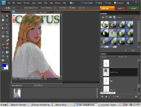
Picture of orginal.

Again to improve my front cover I used the feedback I had got, my improved knowledge of media and Photoshop, and I re-read the research I had carried out eg my analyis and questionnaire.
Firstly I decided that I would be able to take a better picture for my new front cover. Which meant I carried out photoshoot, I used my sister to be my feature article photo person. I took a variety of shots of her, eg some close ups and some long shots. I gave her three different outfits to wear and I had three locations to use. For the props I used a cowboy hat and a guitar in some of the pictures, this represented the genre of country music well.
The picture I chose to use was a mid-shot of her, looking straight at the camera. I chose this shot as I had found that it a convention to use an image like this. Although the background on the picture was outside, I thought it would look more effective if she was cut out from the background. I did this using the lassoo tool on Photoshop. I then added a white background behind her.


I then added the masthead, I already knew that the name of my magazine would be 'Red Cactus' and that I would use the colours red and green. I knew this because this is what I had used on my contents page and I wanted the style to be consistant throughout my magazine. I knew that my masthead should stand out, and because it was quite a long name, I decided to rotate the 'RED' so it was long ways before the 'CACTUS' meaning the word cactus could be in a bigger font. I chose to use the font ERAS BOLD, making the masthead standout.
 .
.
It is a convention that the masthead does not go over the head or body of the person in the feature article photo, meaning that in my orginal front cover I was breaking conventions as mine did. For my new front cover not be breaking conventions I cut out the head of my feature article photo person, and then dragged the text between the two layers, meaning that her head was over the top of the masthead.

Firstly I decided that I would be able to take a better picture for my new front cover. Which meant I carried out photoshoot, I used my sister to be my feature article photo person. I took a variety of shots of her, eg some close ups and some long shots. I gave her three different outfits to wear and I had three locations to use. For the props I used a cowboy hat and a guitar in some of the pictures, this represented the genre of country music well.
The picture I chose to use was a mid-shot of her, looking straight at the camera. I chose this shot as I had found that it a convention to use an image like this. Although the background on the picture was outside, I thought it would look more effective if she was cut out from the background. I did this using the lassoo tool on Photoshop. I then added a white background behind her.


I then added the masthead, I already knew that the name of my magazine would be 'Red Cactus' and that I would use the colours red and green. I knew this because this is what I had used on my contents page and I wanted the style to be consistant throughout my magazine. I knew that my masthead should stand out, and because it was quite a long name, I decided to rotate the 'RED' so it was long ways before the 'CACTUS' meaning the word cactus could be in a bigger font. I chose to use the font ERAS BOLD, making the masthead standout.
 .
.It is a convention that the masthead does not go over the head or body of the person in the feature article photo, meaning that in my orginal front cover I was breaking conventions as mine did. For my new front cover not be breaking conventions I cut out the head of my feature article photo person, and then dragged the text between the two layers, meaning that her head was over the top of the masthead.

I then added my puff line, which from my research I knew should be in a relatively small font postioned either above or below the masthead. I chose to do mine in size 10 font in the colour black and I thought it would stand out well against my masthead. I used a similar puff line as in my orginal front cover, as I thought it portray my genre well. I used the font small fonts, as I liked its simplicity contrasting with the bold mast head.
From my front cover draft I knew that I wanted a strip along the bottom of the page. I add this I used the rectangle tool, I made the strip black and I thought by doing this I could use bright colours and make the text stand out. At the start of the strip I put 'PLUS' in bright yellow and a big font to draw the audiences attention to the strip, as it would be informing them of other artists featuring in the magazine. Although yellow was not orgnially in my colour scheme I decided to use it as it stood out. I used relativley small font for the rest of my strip, making my page look balanced.

I then added the important information on my front cover, which is the price, the issue number and the barcode. From my front cover analyis I found that the barcode is usually positioned in the bottom right hand corner of the front cover. Therefore to follow conventions and make my magazine recognisable I placed my barcode at the end of my strip. Again following conventions I made my price and issue number in a simple font, in size 9 in the colour black, and I postioned it underneath.
From my front cover draft I knew that I wanted a strip along the bottom of the page. I add this I used the rectangle tool, I made the strip black and I thought by doing this I could use bright colours and make the text stand out. At the start of the strip I put 'PLUS' in bright yellow and a big font to draw the audiences attention to the strip, as it would be informing them of other artists featuring in the magazine. Although yellow was not orgnially in my colour scheme I decided to use it as it stood out. I used relativley small font for the rest of my strip, making my page look balanced.

I then added the important information on my front cover, which is the price, the issue number and the barcode. From my front cover analyis I found that the barcode is usually positioned in the bottom right hand corner of the front cover. Therefore to follow conventions and make my magazine recognisable I placed my barcode at the end of my strip. Again following conventions I made my price and issue number in a simple font, in size 9 in the colour black, and I postioned it underneath.

Although in my planning I had decided that I would add a circle in the bottom left of my front cover, but because when I looked at my front cover I thought that there was quite a large white gap between the issue number and my feature article photo persons head I decided to put my circle there. As I thought the gap was too small for text, but too large to be left. I made the circle orange, with yellow and black writing in.
I then added the four pieces of text down the right handside of the page. I chose to use the colours red and black, red was for the main text, and then black for the comment underneath. Black was the smaller font, and the red font was in captial letters, I did this to make it stand out, making it obvious to the audience which was the more important text.
I then added the four pieces of text down the right handside of the page. I chose to use the colours red and black, red was for the main text, and then black for the comment underneath. Black was the smaller font, and the red font was in captial letters, I did this to make it stand out, making it obvious to the audience which was the more important text.

I then added added the feature article photo text, which would be the largest text on the page, as it is the featuring article. I made it size 90pt, in font Rockwell Bold I made it orange, and it was also in captial letters. All these aspects of the text made it stand out. I chose the colour orange because so far it had been the colour from my colour scheme that had been least used on the page.

I then added the picture in the bottom left of the page, which was relativley small. By adding this it meant I was following conventions of music magazine front covers. I chose to use a close up, to show variety of shots used on my front cover. To ensure that the photos I had used interested my reader. I then added a boarder around this photo. I did this using the shape tool, I drew a rectangle around the photo, and then dragged the rectangle layer below the picture layer. I did this to make the picture stand out.
I then added another circle at the bottom of the page, I did this the same size as the other circle, to make my front cover consistant.

The final piece of text I added to my front cover was at '8 page tour poster' at the top right hand side. I also added a small picture here, being an example of one of the 'tour posters'. This would be used to attract the reader. I used a plus sign here also which I think gave the poster a relaxed, informal tone. I made the plus sign, size 38pt, to make it stand out.
.
Final new front cover
I then added another circle at the bottom of the page, I did this the same size as the other circle, to make my front cover consistant.

The final piece of text I added to my front cover was at '8 page tour poster' at the top right hand side. I also added a small picture here, being an example of one of the 'tour posters'. This would be used to attract the reader. I used a plus sign here also which I think gave the poster a relaxed, informal tone. I made the plus sign, size 38pt, to make it stand out.
.

Final new front cover

Overall I think that my new front cover has improved from my orginal one. I think it looks very different, because my first was was a lot more simplistic, I think the more detail on my new front cover would attract the audience more. Mainly because it shows the wide variety of stores and articles featuring within the magazine.
No comments:
Post a Comment