I then did mainly the same for the second page.
Using the same fonts, colours and sizes I typed up the rest of the interview.
At the top right hand corner I added a rectangle, the same colour as the heading and they made up some tour dates of 'Rose Page.' I used slighty bigger fonts for this as it was a smaller box so didnt need as much text in. Also so that it stood out.
Thursday, 8 April 2010

Double Page Spread (STAGE 2)
When I inserted the photo's I positioned the one on the first page so that there was room above it for a heading.
I knew that the main colours used on my double page spread should be black, orange and red because they were the colours I had used throughout the rest of my magazine.


I knew that the main colours used on my double page spread should be black, orange and red because they were the colours I had used throughout the rest of my magazine.
As I had used Bookman Old Style font for most of my magazine so far, I decided to use a didnt one for the heading. I chose to have the heading in italics, size 70pt, in the font Monotype Corsiva and in pink/red colour. I decided all these as I thought that they suited the page and magazine well. And because size 70pt helped the reader understand straight away what this page was about as there attention was drawn too the heading.

On the first page of my double page spread I typed up the draft I had written for the interview with 'Rose Page' making a few changes to it.
I used went back to using bookman old style font for the writing, and used a size 13 font. This size was the most appropriate for the amount of text I wanted on the page.
I decided to use different colour text for the questions and answers so the reader could easily distinguish between each.
I used orange for the questions and black for the answers.
Once I had typed up nearly all of the interview for the first page I realised that the page looked uneven in a image:text ratio. So instead of putting more text in the bottom right hand corner I chose another image I had taken to put there.
As all the other images on the page were posed images, I chose a candid image.
Like the other pictures on the page I inserted an orange boarder.

Saturday, 3 April 2010
Double Page Spread (STAGE ONE)
From my planning of photo's I had a ruff idea of what photo's I would be using my double page spread.
Once I had chosen my photo's I opened two photoshop documents and inserted one pictures on the top of the first page, then the other two pictures onto the second page.

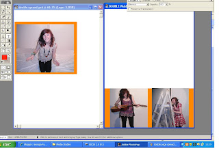
On photoshop I had edited these pictures, as some of the backgrounds look really dark.
Before


Once I had chosen my photo's I opened two photoshop documents and inserted one pictures on the top of the first page, then the other two pictures onto the second page.

I then added boarders to the pictures, as I had done this on my front cover and contents page so this would make the magazine consistant.

On photoshop I had edited these pictures, as some of the backgrounds look really dark.
I mainly used the blurring, paintbrush, cropping and smuding tool to do this.

Before
After

I then did this with the other photos.
Sunday, 7 March 2010
Contents Page (STAGE 3)
Whilst I was on hoilday in Yorkshire, I took some pictures of the moors. And I thought they represented the English countryside well so i decided to use one of them as a background to my contents page.


I decided to use this photo because I thought it represented the genre of my magazine well. As it clearly conveys the English Countryside.
With the help of my teacher I realised that the snow picture on my contents page was a better image and of slighty better quality, so I rearranged the pictures.

At this stage my contents page could have been finished, but I felt like more could have been added to it. I decided to add boarders to the pictures.
The first one I added was a thin black border, but I didnt use it as it didnt stand out enough.
I then changed the colour of it to red and then to white, and kept increasing the thickness untill it stood out.

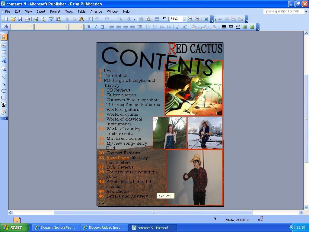
I then decided to use white boaders round the large picture and red boarder round the smaller pictures, and 4pt in thickness. I chose this because I thought they stood out well against the background of the contents page and they drew the readers attention to the pictures.

The finally step in my contents page was to add page numbers in the bottom right hand side of each pictures, telling the reader where to find the relating story. This is a typical magazine convention.
Sunday, 28 February 2010
Contents Page (STAGE 2)
Next I needed to decide from the pictures I had taken which ones I would use on my contents page. I needed to choose 4 completely different ones.
One of my feature article photo's, and three others.

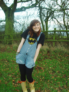


One of my feature article photo's, and three others.
Photo 1:


These were are the two photo's that I liked the most, and wanted to use one of them on my contents page.
I have chosen to use the waving one because the other photo was a little but blurred.
I then had to choose from the snow pictures what one to use, I decided to use one where a guitar was involved because I hadnt used any pictures with a guitar in yet and as its a country music magazine I thought there should have been.
I now wanted to use a picture of a boy, and the only ones I had taken were of Michael, and i didnt havent many good ones, so it was easy to chose the best picture.
And then finally I wanted a candid image of someone performing and seems I only had one of them I had no choice but to use it.
So I then added all the pictures to the page.

And I played around with different postions they could go in, and which ones were big and which ones were small.
I then noticed that the picture of Michael had an uneven, unprofessional looking background. So i opened it up in paint, and from the side where the picture looked good, i copy and pasted a square of it onto the side of the picture that looked dark.

Contents Page (STAGE 1)
To create my contents page, I will be using Microsoft Publisher.
Firstly I looked at the sketch I had drawn for my double page spread and typed up the text containing was is actually going to be on the contents page.
I used size font size 20pt as it was a similar size to what I had use with some of the text on my front cover. And I used 'bookman old style' for my font.


Firstly I looked at the sketch I had drawn for my double page spread and typed up the text containing was is actually going to be on the contents page.
I used size font size 20pt as it was a similar size to what I had use with some of the text on my front cover. And I used 'bookman old style' for my font.
I then put in the heading contents, and tried it in a few different texts, slanted different ways, and in different sizes.
I then added the magazine name 'Red Cactus' to the top of the page, and like on my sketch I changed the colour of the R to red. Emphasing the name of the magazine.
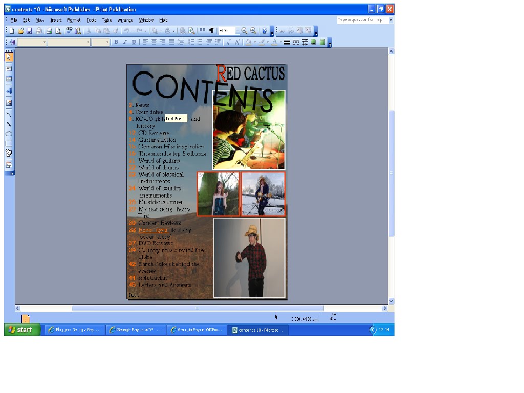
Once of the main body of the text was done, I tried different colour backgrounds for the page.


Front Cover (STAGE 5)
I had sketched out a logo for my magazine.
So on paint I drew the cactus, and filled it in red. Once I had done this i decided to put it in the top right hand corner of my magazine as that was the place with an unfilled gap.

Then on photo shop I used the pencil tool too put some spikes onto the cactus. I used black, and brush size 9 to do this.
Subscribe to:
Posts (Atom)