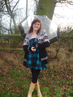
I then went through all the pictures I had taken and chose 4 photo's that could all be used as my feature article photo. I then looked at the postives and negatives of each photo to help me decide which photo to use.
1. It's a photo that would not need a lot of editing
2. The ladder and outfit she is wearing create's a country style image
3. Her smiling facial expression is good as she looks happy suggesting she enjoys music
Negatives:
1. She is not looking at the reader, so not engaging them straight away
2. The background is darker on the left
3. The ladder in the picture is bold so if on the front cover might draw attention away from the artist and the text on the front page.
Photo two:
Postives:
1. Natural background giving a country lifestyle vibe
2. She is looking directly at the reader, engaging them
3. Her outfit and the umbrella reflect the style of the magazine
4. Its very colourfull
5. Wouldn't need much editing
6. She is in the centre of the picture
Negatives:
1. You cant see the end of her wellies
2. Her facial expression could be queried
Photo three:
Postives:
1. She is smiling, looking very happy giving a friendly style to the magazine
2. She is in the centre of the picture
3. The guitar reflects country music
Negatives:
1. Would need a lot of editing to make it look like a professional photo shoot
2. Here shadow is in the picture
Photo four:
Postives:
1. The shot shows personality
2. The background reflects country lifestyle
3. She looks natural and happy
4. She is in the centre
Negatives:
1. She is not looking at the reader
2. The sun is blurring part of the picture
From all the postives and negatives I have decided not to use picture one and four and she is not looking directly at the reader and that is a convention of magazines that I want to include in my magazine. I have decided not to use picture three because it would need a lot of editing to make it look professional and the quailty of it might not be sufficient to use as a front cover photo.
So i have decided to use picture two, although its simple I think that with some editing it will work best with my magazine.


No comments:
Post a Comment