Sunday, 28 February 2010

Contents Page (STAGE 2)

Next I needed to decide from the pictures I had taken which ones I would use on my contents page. I needed to choose 4 completely different ones.
One of my feature article photo's, and three others.


Photo 1:


These were are the two photo's that I liked the most, and wanted to use one of them on my contents page.


I have chosen to use the waving one because the other photo was a little but blurred.


I then had to choose from the snow pictures what one to use, I decided to use one where a guitar was involved because I hadnt used any pictures with a guitar in yet and as its a country music magazine I thought there should have been.

I now wanted to use a picture of a boy, and the only ones I had taken were of Michael, and i didnt havent many good ones, so it was easy to chose the best picture.


And then finally I wanted a candid image of someone performing and seems I only had one of them I had no choice but to use it.


So I then added all the pictures to the page.


And I played around with different postions they could go in, and which ones were big and which ones were small.


I then noticed that the picture of Michael had an uneven, unprofessional looking background. So i opened it up in paint, and from the side where the picture looked good, i copy and pasted a square of it onto the side of the picture that looked dark.

Contents Page (STAGE 1)

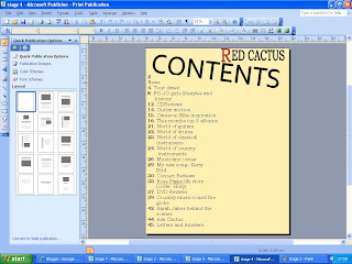
To create my contents page, I will be using Microsoft Publisher.

Firstly I looked at the sketch I had drawn for my double page spread and typed up the text containing was is actually going to be on the contents page.
I used size font size 20pt as it was a similar size to what I had use with some of the text on my front cover. And I used 'bookman old style' for my font.

I then put in the heading contents, and tried it in a few different texts, slanted different ways, and in different sizes.
I then added the magazine name 'Red Cactus' to the top of the page, and like on my sketch I changed the colour of the R to red. Emphasing the name of the magazine.
Once of the main body of the text was done, I tried different colour backgrounds for the page.


Front Cover (STAGE 5)

I had sketched out a logo for my magazine.

So on paint I drew the cactus, and filled it in red. Once I had done this i decided to put it in the top right hand corner of my magazine as that was the place with an unfilled gap.


Then on photo shop I used the pencil tool too put some spikes onto the cactus. I used black, and brush size 9 to do this.

Front Cover (STAGE 4)

I now needed to add all the text to my front cover. From my questionnaire I rougly knew what fonts I should use and what sizes and what colours.
I also knew that I wouldnt too completely be able to stick to what I found out from my survey, as certain things wouldnt look right on the page.

I first of all chose to use purple and green as the main colours of the fonts on my front cover. But when I changed the colour of my text. It blended to much with the sepia background.
So although it was going against what I found out from my survey I tried out different colours for my text, and decided to use orange and cream. I decided to use these colours as I thought they contrasted well with the sepia background.

Now I knew what colour my text will be, I used my sketches to add all the text. From my questionnaire I knew the font should be 'Bookman Old Style' I used this font consistanly for the whole of the front cover.
For the quote ' My life and music is amazing right now' I still used 'bookman old style' but I put it in italics. I did this because it was a typical of a music magazine to put in italics something someone has said.

The sizes of my font varied four times.
130pt for the masthead
54pt for main feature article text
28pt for the puff line and other text eg, issue number
21pt for names of other featuring artists
I chose these text sizes to make the page appear more dynamic and intresting for the reader. It also allows me to highlight issues of greater significants or intrest.

Front Cover (STAGE 3)

From my questionnaire I knew which colours should be used on my front cover. And from my sketches I knew how to lay my magazine name out on the page.
I found it hard to rotate the text to an angle which wasnt cutting too much of the persons head off, or looking like the text was too far down the page.


I then uploaded a barcode, issue number, and date to the bottom left hand side of my magazine, this is a convention of magazines.


I then thought that my front cover looked plain with only one picture on. So I went through all the pictures I had taken and chose two to put at the bottom of the cover, in a small size. As my masthead was tilted across the page I thought that the pictures at the bottom should also be tilted.

I chose two candid images, which I had taken at school.
When I inserted the pictures onto the front cover I found that they blended with my main picture too much, so I used the shape tool and drew too rectangles over the pictures a little larger than the actuall picture. Then on my layers, I dragged the pictures so the appeared over the rectangles. But as the rectangles were bigger they acted like a boarder. I chose to have the sapes black as it matched the masthead.

I then realised that my puff line didnt stand out enough. So like I did with the two pictures at the bottom I drew a rectangle over the puff line, and in my layers I put it behind the text.
The black of the rectangle then looked to dark, so I lowered the opacity of it so that the background of the main picture could still be slighty seen through the shape. I lowered it to 67%.

67% 100%


Tuesday, 16 February 2010

Front Cover (STAGE 2)

I then cut out Serena from the background, I found this a little difficult to get the edges cut out perfectly.


And I tested out a few different things I could do to the background.

Tinted Purple


Brightness Contrast


Tinted Green


Sepia


Black And White


I chose to use the sepia background as I thought the person in the picture stands out more, this is because of the colours she is wearing. The sepia background also portrays the County music genre well. As the colour are natural.


Production Of Front Cover (STAGE 1)

Firstly I looked at my front cover sketch refresing my memory on what I had designed my front cover to look like.

I then went through all the pictures I had taken and chose 4 photo's that could all be used as my feature article photo. I then looked at the postives and negatives of each photo to help me decide which photo to use.

Photo one:

Postives:

1. It's a photo that would not need a lot of editing

2. The ladder and outfit she is wearing create's a country style image

3. Her smiling facial expression is good as she looks happy suggesting she enjoys music


Negatives:

1. She is not looking at the reader, so not engaging them straight away

2. The background is darker on the left

3. The ladder in the picture is bold so if on the front cover might draw attention away from the artist and the text on the front page.


Photo two:

Postives:

1. Natural background giving a country lifestyle vibe

2. She is looking directly at the reader, engaging them

3. Her outfit and the umbrella reflect the style of the magazine

4. Its very colourfull

5. Wouldn't need much editing

6. She is in the centre of the picture


Negatives:

1. You cant see the end of her wellies

2. Her facial expression could be queried


Photo three:

Postives:

1. She is smiling, looking very happy giving a friendly style to the magazine

2. She is in the centre of the picture

3. The guitar reflects country music


Negatives:

1. Would need a lot of editing to make it look like a professional photo shoot

2. Here shadow is in the picture


Photo four:

Postives:

1. The shot shows personality

2. The background reflects country lifestyle

3. She looks natural and happy

4. She is in the centre


Negatives:

1. She is not looking at the reader

2. The sun is blurring part of the picture

From all the postives and negatives I have decided not to use picture one and four and she is not looking directly at the reader and that is a convention of magazines that I want to include in my magazine. I have decided not to use picture three because it would need a lot of editing to make it look professional and the quailty of it might not be sufficient to use as a front cover photo.


So i have decided to use picture two, although its simple I think that with some editing it will work best with my magazine.


Other Photo's I have Taken

For the past couple of months I have been taking random pictures which could be used in my magazine.


I took some of my sister in December when it snowed. I took these pictures as I thought it doesnt snow very much, so they would be a nice setting for one or two of the photo's in my magazine, giving some variety to the selection of photo's used.


I took one of my two friends performing at a gig, I did this because I thought it would be a good photo to have which I could use on my contents page.


The day I took some pictures for my feature article photo i also took some of my friend Michael which I could use on my front cover or contents page.


Second Taking of Photo's

I had already taken some photo's with a posed photoshoot looking background I now needed some natural background photo's.
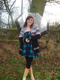
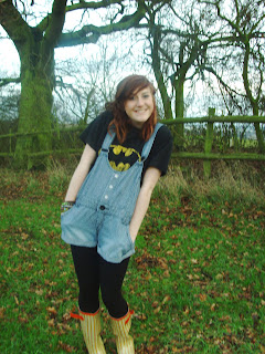
I took of them again of my friend Serena as she was being the person in my feature article. I took them in my garden this time. I thought that these photo's should give of a real country image because of the setting of the photos.

I had two different outfits, creating the country lifestyle image.

I tried to keep the pictures as natural as possible, the only prop I was an umbrella.
I took about 50 photo's I then narrowed it down to 20 and asked my teacher to give his opionion on which pictures would work well in my magazine and which ones wouldnt, it was then narrowed down to 8 photo's and I had to decide which ones I wanted to use.

Here are some more of the pictures I took.


First Taking Of Photo's

After i had planned my photo's, on the 21st of January I booked to use a drama room at school to take my photo's in. I used two large white background stands, and two large white sheets which were borrowed from the art department. I laid these out on the floor infront of the two background stands. I knew how to use the lights in the room so to make the photo's more realistic I used the lights, there main lights were shining onto the background stand and white sheets.

I took pictures of my friend Serena, I brought four different outfits for her to wear, i did this because I could use a few of these pictures throughout my magazine and she would be in different clothing. The clothes I brought for her were outfits I thought a typical country music would wear. Other props like a guitar, a chair and a ladder were used in some of the pictures, adding to the country music image. Here are some of the different outfits.


Overall I had taken about 80 photo's, I then uploaded the photo's onto my computer and narrowed the photo's down which could be a possiblilty to use in my magazine. I then took them into school and asked my teacher what pictures he thought would work best in my magazine, it was then narrowed down to 10 photo's, and left up to me to decide which pictures I was going to use. I know that some of my photo's will need some editing to make them look approatiate and professional, eg some will need blurring as the background stands dont meet and there is a black gap.

Here are some more of the pictures taken.