Sunday, 8 May 2011

New Double Page Spread.


I liked the style of my orginal double spage spread as I thought it represented my genre of country music well. There I decided to keep the overall style, eg colours.

Firstly I decided that I would keep the colour of the text orange and black, as I thought the text stood out well as they are two contrasting colours. I realised after I had printed my orginal double page spread that the text was two large, (12pt) therefore I made the new text size 9pt.


I added the photos that I had taken, from my research I decided that instead of having four pictures like on my orginal one, I should have three and make them bigger. I therefore add the pictures where I thought made the page look balanced, and then rearranged the text columns around the images.


As one aspect of my text was an introduction to the story, I decided to make that it a bigger font, to attract the audience. I made it size 13pt which was considerably bigger. To ensure that I was following conventions I made the first letter of the text bigger, this would make my double page spread recognisable.


I then added the heading for my double page spread, which after hearing the feedback from my orignal double page spread I found that it should be bigger. Therefore I just decided to have her name across the top of the page in size, 128pt. I also had this font in italics as I thought it represented the genre of my magazine well. I chose to do it in red as this was the colour on my magazine that had been most used.


I knew that a convention of double page spreads is the use of quotes, this makes the page more interesting and the quotes will attract the audience to read more of the story. There I added one large quote on the largest picture of Rose Page. And then I added one before the interview as I thought if the audience read it they would want to know more about the quote. I added the final quote to help balance the page and make it seem more interesting. I also added captions on to the bottom on the two large pictures on my page, this meant I was following conventions of country music double page spreads but it also gave some background information to the pictures I had used.


The final aspects I added to my double page spread was the page number at the bottom of the page, which I repeated throughout my magazine, and then the magazine name in the right hand corner which was also repeated throughout my magazine. Each time I added these aspects to my pages I ensured that they were exactly the same colours, making my magazine constant. To do this I used the colour grabber tool on Photoshop.


I then added a text box in the last columns which contained the tour dates of my featuring artist, this meant I was following conventions. I also added it because I thought it made my page look more interesting.

I then added the background to my magazine, which I was unsure of what colour to use. After trying many colour I decided to use a light yellow as I thought that it brightened the page and made the text all stand out.


Overall I feel that my new double page spread was quite similar to my orginal one, mainly because of the style, and the tone used. The main aspects that I think improved the quality of my double page spread was the layout and the new pictures. As I think they were more appealing to the audience.

New Front cover.

Orginal year 12 front cover

Picture of orginal.


Again to improve my front cover I used the feedback I had got, my improved knowledge of media and Photoshop, and I re-read the research I had carried out eg my analyis and questionnaire.

Firstly I decided that I would be able to take a better picture for my new front cover. Which meant I carried out photoshoot, I used my sister to be my feature article photo person. I took a variety of shots of her, eg some close ups and some long shots. I gave her three different outfits to wear and I had three locations to use. For the props I used a cowboy hat and a guitar in some of the pictures, this represented the genre of country music well.

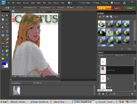
The picture I chose to use was a mid-shot of her, looking straight at the camera. I chose this shot as I had found that it a convention to use an image like this. Although the background on the picture was outside, I thought it would look more effective if she was cut out from the background. I did this using the lassoo tool on Photoshop. I then added a white background behind her.


I then added the masthead, I already knew that the name of my magazine would be 'Red Cactus' and that I would use the colours red and green. I knew this because this is what I had used on my contents page and I wanted the style to be consistant throughout my magazine. I knew that my masthead should stand out, and because it was quite a long name, I decided to rotate the 'RED' so it was long ways before the 'CACTUS' meaning the word cactus could be in a bigger font. I chose to use the font ERAS BOLD, making the masthead standout.

.

It is a convention that the masthead does not go over the head or body of the person in the feature article photo, meaning that in my orginal front cover I was breaking conventions as mine did. For my new front cover not be breaking conventions I cut out the head of my feature article photo person, and then dragged the text between the two layers, meaning that her head was over the top of the masthead.


I then added my puff line, which from my research I knew should be in a relatively small font postioned either above or below the masthead. I chose to do mine in size 10 font in the colour black and I thought it would stand out well against my masthead. I used a similar puff line as in my orginal front cover, as I thought it portray my genre well. I used the font small fonts, as I liked its simplicity contrasting with the bold mast head.

From my front cover draft I knew that I wanted a strip along the bottom of the page. I add this I used the rectangle tool, I made the strip black and I thought by doing this I could use bright colours and make the text stand out. At the start of the strip I put 'PLUS' in bright yellow and a big font to draw the audiences attention to the strip, as it would be informing them of other artists featuring in the magazine. Although yellow was not orgnially in my colour scheme I decided to use it as it stood out. I used relativley small font for the rest of my strip, making my page look balanced.


I then added the important information on my front cover, which is the price, the issue number and the barcode. From my front cover analyis I found that the barcode is usually positioned in the bottom right hand corner of the front cover. Therefore to follow conventions and make my magazine recognisable I placed my barcode at the end of my strip. Again following conventions I made my price and issue number in a simple font, in size 9 in the colour black, and I postioned it underneath.


Although in my planning I had decided that I would add a circle in the bottom left of my front cover, but because when I looked at my front cover I thought that there was quite a large white gap between the issue number and my feature article photo persons head I decided to put my circle there. As I thought the gap was too small for text, but too large to be left. I made the circle orange, with yellow and black writing in.

I then added the four pieces of text down the right handside of the page. I chose to use the colours red and black, red was for the main text, and then black for the comment underneath. Black was the smaller font, and the red font was in captial letters, I did this to make it stand out, making it obvious to the audience which was the more important text.


I then added added the feature article photo text, which would be the largest text on the page, as it is the featuring article. I made it size 90pt, in font Rockwell Bold I made it orange, and it was also in captial letters. All these aspects of the text made it stand out. I chose the colour orange because so far it had been the colour from my colour scheme that had been least used on the page.


I then added the picture in the bottom left of the page, which was relativley small. By adding this it meant I was following conventions of music magazine front covers. I chose to use a close up, to show variety of shots used on my front cover. To ensure that the photos I had used interested my reader. I then added a boarder around this photo. I did this using the shape tool, I drew a rectangle around the photo, and then dragged the rectangle layer below the picture layer. I did this to make the picture stand out.

I then added another circle at the bottom of the page, I did this the same size as the other circle, to make my front cover consistant.


The final piece of text I added to my front cover was at '8 page tour poster' at the top right hand side. I also added a small picture here, being an example of one of the 'tour posters'. This would be used to attract the reader. I used a plus sign here also which I think gave the poster a relaxed, informal tone. I made the plus sign, size 38pt, to make it stand out.

.

Final new front cover


Overall I think that my new front cover has improved from my orginal one. I think it looks very different, because my first was was a lot more simplistic, I think the more detail on my new front cover would attract the audience more. Mainly because it shows the wide variety of stores and articles featuring within the magazine.

New Contents Page.

This is my orginal year 12 contents page.


I had an idea in my head what changes I could make to my contents page, which I then drew in a draft. The main changes I was focusing on was the text position, the background, the positioning of the pictures, and the positioning of the mast head.

Firstly with my masthead, as I found from my feedback that many people thought that a straight heading could have been better rather than a diagonal one. I agreed with this change, therefore I made 'contents' straight. I then thought that from magazine I had looked at not many of them actually said 'contents' at the top of them. I thought to make my contents look more sophiscated I could use the heading 'this month' instead. I did this in black to make it stand out. In my year 13 coursework to give a piece of text on my front cover an mysterious I feel about it I added a glow around the outside of this. Although I didnt want to make my contents page mysterious I decided to try this glow, around the outside of this text, and I thought that it made the text stand out. Which would therefore attract the reader.


As I thought that the colour scheme I had used for my orginal contents page was appropriate and effective I decided to keep the colour similar. As I used, orange, black, red, and just added the colours white and green. The reason I added the colour green was to represent the name of my magazine which was 'Red Cactus'. I kept the name from my year 12 magazine as I thought it represented the genre of my magazine well.

I then added my text to my new contents, which I copied quite closely from my orginal contents page. The only thing that I think I improved on was the used of different colours, fonts and sizes within the block of text. For example in my orginal front cover the font was all black, however I used white, black, red and green to make certain parts of the text stand out and to make it attractive for the audience. I also edited the position of my text as instead of having the whole block down the left hand side, I spilt it in two and then had one half of it at the bottom of the page. This made the page seem more balanced.


From looking at the colours I was using on my contents page, I decided that instead of using a photo background like I had orginally a coloured background would look better. It would also allow for all the text to be properly read. I chose to use a light colour which I thought would make all the text and writing stand out. I chose to use a cream/ yellow colour as I thought it brightened the page.

After reading over my research, which said that there was a mixed amount of pictures on the contents pages that I analysed, I decided to use six pictures on my new contents page. I thought this is a good number to use, as it wouldnt make my contents page to seem too busy, which is a convention of country music contents page. This amount of pictures also allowed me to be able to vary the size of each picture. I used some of the orginal pictures I had taken for my first contents page and I then took some new pictures. I ensured that the pictures I chose to use had a variety of camera shots. I did this to make each picture individually interesting. I wanted there to be one main picture on the page, so I placed this in the top middle of the page. I then added the pictures evenly around the page. I made the two pictures at the top of the page the same size and in the same position to make my page look balanced.


To make the pictures seem more interesting I edited one of them to make it black and white. I did this my using the effects tool on Photoshop. I could then change the hue and saturation meaning I could choose how dark I wanted the picture to be. I chose to not make it too dark because the rest of the page was relatively light meaning I didnt want the picture to contrast too much.


I then followed conventions of a music magazine contents page, and put a page number on the picture. This would be useful for the audience as if they saw a picture or a story they were interested in they would know where too look for it in the magazine. To make the page look neat I decided I would put all of these number in black, which was then a problem for some pictures as the bottom right of the picture was dark, meaning that the number couldnt be seen. To get around this problem I decided to put a rectangle underneath the page number on top of the picture. I made this rectangle the same colour of the picture so that it blended in.


Once the pictures were in place I had a large gap on the page on the bottom right. Instead of filling this space with another picture, I decided that a box would go best there with a competition in. I chose to make the text box black so that it stood out, by doing this it also meant I could have a bright coloured writing. I chose to have orange writing. I used different sizes font throughout the box, to emphaise which was the most important information. The font I used for the heading of the box was 'Bodoni MT' which is a bold high impact font to attract the audience.


I then used my draft to look at what other fonts I was planning to put on the page. All that was left to add was quotes and text related to each picture. On two of the pictures I decided to put text about the story on the bottom of the actual picture, this was meeting conventions of general mazagines. I chose to do it in a small font, so that the main attention was to the pictures. And I chose to do it in red as it I thought that colour stood out well against both of the pictures.


Underneath my masthead there was a large gap, which I thought made the page seem unbalanced. I had not planned this in my draft but I decided to add the month of the magazine release date. I did this in a fairly large text, and in orange font so that it stood out.

I then added text underneath the large picture on the page, which was a quote from the starring singer. This quote would make the audience want to know more, and therefore want to read the story.


In the bottom left hand corner, I had left room for the letters 'RC' and the page number of the magazine. Which is a conventions of magazines. I did the RC in red and green, and then did this 'Page 36' in black to make it stand out aganist the RC.

In the top right hand corner of my magazine I wrote 'Red Cactus' which is a convention of most music magazines. I also did this in red and green meaning it was like a trademark for my magazine name, meaning it would be recognised by my audience.


Final new contents page


Overall I think that my contents page is significantly better than my orginal one, mainly because the enhanced understanding of media I have learnt and the significant improvement of my use of Photoshop. The main aspect that I think improved was the positioning of the images and text, and the use of different colours, sizes, fonts, bold, and italic to make the page more appealing and interesting to read.

Resit

I decided to redo my year 12 coursework. I made this decision because I thought that from my use of Photoshop over the course of year 13 I could significantly improved the standard of my productions. To help me I read through my blog, to remind myself of the conventions of a country music magazine, which meant I knew I would be creating a product which would be recognisable to the target audience. I also used feedback I had got about my coursework productions, which allowed me to understand which aspects of them could be improved.

Thursday, 8 April 2010

Double Page Spread (STAGE 3)

I then did mainly the same for the second page.
Using the same fonts, colours and sizes I typed up the rest of the interview.

At the top right hand corner I added a rectangle, the same colour as the heading and they made up some tour dates of 'Rose Page.' I used slighty bigger fonts for this as it was a smaller box so didnt need as much text in. Also so that it stood out.

Double Page Spread (STAGE 2)

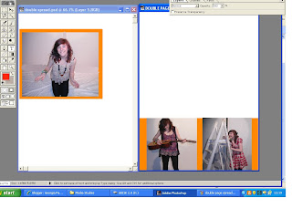
When I inserted the photo's I positioned the one on the first page so that there was room above it for a heading.
I knew that the main colours used on my double page spread should be black, orange and red because they were the colours I had used throughout the rest of my magazine.

As I had used Bookman Old Style font for most of my magazine so far, I decided to use a didnt one for the heading. I chose to have the heading in italics, size 70pt, in the font Monotype Corsiva and in pink/red colour. I decided all these as I thought that they suited the page and magazine well. And because size 70pt helped the reader understand straight away what this page was about as there attention was drawn too the heading.


On the first page of my double page spread I typed up the draft I had written for the interview with 'Rose Page' making a few changes to it.

I used went back to using bookman old style font for the writing, and used a size 13 font. This size was the most appropriate for the amount of text I wanted on the page.

I decided to use different colour text for the questions and answers so the reader could easily distinguish between each.

I used orange for the questions and black for the answers.


Once I had typed up nearly all of the interview for the first page I realised that the page looked uneven in a image:text ratio. So instead of putting more text in the bottom right hand corner I chose another image I had taken to put there.

As all the other images on the page were posed images, I chose a candid image.

Like the other pictures on the page I inserted an orange boarder.


Saturday, 3 April 2010

Double Page Spread (STAGE ONE)

From my planning of photo's I had a ruff idea of what photo's I would be using my double page spread.
Once I had chosen my photo's I opened two photoshop documents and inserted one pictures on the top of the first page, then the other two pictures onto the second page.


I then added boarders to the pictures, as I had done this on my front cover and contents page so this would make the magazine consistant.

On photoshop I had edited these pictures, as some of the backgrounds look really dark.
I mainly used the blurring, paintbrush, cropping and smuding tool to do this.

Before
After
I then did this with the other photos.